






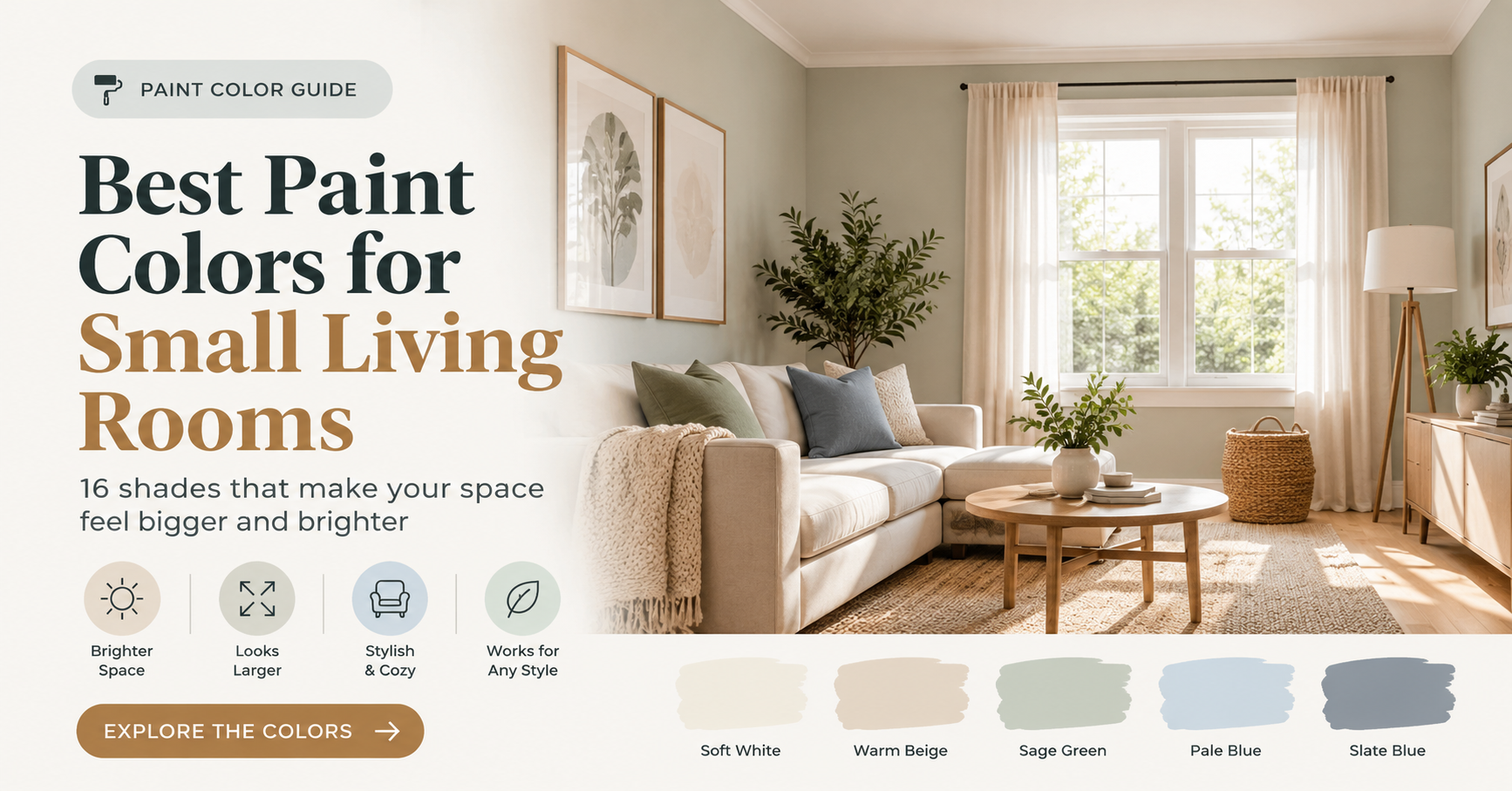

A small living room can feel like a puzzle. You want it to be cozy, stylish and comfortable, yet you also want it to feel open, bright and far larger than its actual size. The good news is that paint is one of the most powerful and affordable tools you have. The right color can bounce light around the room, soften harsh corners, visually lift the ceiling and set the exact mood you want for relaxing, entertaining or working from home.
In this complete guide, you will learn how to choose the best paint colors for small living rooms, why certain shades work better than others, and how lighting, undertones and finishes change the final result. You will also find 16 carefully selected shades across four categories, practical testing steps, common mistakes to avoid and answers to the questions homeowners ask most often.
Why Paint Color Matters So Much in a Small Living Room
In a large room, a wrong color choice may simply look odd. In a small room, it can make the space feel cramped, dark or cluttered. Because walls, ceiling and trim take up such a large share of what your eyes see, color has an outsized effect on how big a small room feels.
Here is what the right paint color can do for you:
- Reflect more light. Lighter shades bounce natural and artificial light around the room, which reduces shadows and makes walls seem to move back.
- Blur boundaries. Soft, low-contrast colors make corners and edges less noticeable, so the room reads as one continuous space.
- Create height. A ceiling that is lighter than the walls, or painted in a softly blended tone, appears higher.
- Set the mood. Warm shades feel welcoming, cool shades feel calm and deep shades feel intimate and dramatic.
- Make furniture look intentional. A cohesive palette helps a small room feel curated instead of crowded.
Before You Pick a Color: 5 Things to Understand
1. Light Reflectance Value (LRV)
Light Reflectance Value, usually shortened to LRV, is a number from 0 to 100 that tells you how much light a paint color reflects. Pure black sits near 0 and bright white sits near 100. For small living rooms that lack natural light, colors with a higher LRV (generally 60 and above) are the safest way to make the room feel brighter. You can usually find the LRV on the back of a paint chip or on the manufacturer’s color page.
2. Undertones
Every paint color has a hidden undertone. A gray may lean blue, green, purple or beige. A white may lean yellow, pink or gray. Undertones become obvious once the paint is on your wall and sitting next to your flooring, sofa and curtains. Always judge a color beside your fixed elements, such as floors, countertops or large furniture, and not on its own.
3. Natural Light Direction
The direction your windows face changes how paint looks throughout the day. The graphic below shows a simple way to match color temperature to light.

- North-facing rooms receive cooler, softer light. Warm whites and warm greiges stop the room from feeling gloomy.
- South-facing rooms enjoy bright, warm light for most of the day, so almost any shade works, including cooler colors.
- East-facing rooms glow warmly in the morning and turn flatter in the afternoon. Balanced neutrals perform best.
- West-facing rooms look dramatic at sunset, when warm light can intensify yellows and reds. Slightly cooler or greener shades keep things balanced.
4. Artificial Lighting
Bulbs matter just as much as windows. Warm white bulbs (around 2700K) bring out the cozy side of a color, while cool daylight bulbs (5000K and above) can make the same paint look sharper and more bluish. For living rooms, soft warm white bulbs are usually the most flattering choice.
5. Paint Finish
The finish changes how much light bounces off the wall. Flat and matte finishes hide surface flaws but reflect less light. Eggshell and satin finishes have a gentle glow that helps small rooms feel brighter while remaining easy to wipe clean. For most living room walls, eggshell is a reliable all-round choice. Use satin or semi-gloss on trim and doors for durability and a crisp, subtle contrast.
The 16 Best Paint Colors for Small Living Rooms
The shades below are grouped by style so you can quickly find the direction that suits your home. The colors shown in the images are approximate screen versions. Paint always looks different in real life, so test each shade in your own room before you commit.
Category 1: Soft Whites and Off-Whites
White remains the classic answer for tiny rooms, but not all whites are equal. A stark, bluish white can feel cold and clinical, while a slightly softened white feels clean, warm and inviting.

1. Alabaster (Sherwin-Williams)
Alabaster is a soft, creamy white with a gentle warm undertone. It is bright enough to open up a compact room yet warm enough to feel comfortable in the evening. It pairs beautifully with natural wood, linen upholstery and brass accents, which makes it a favorite for cozy modern and farmhouse looks.
2. White Dove (Benjamin Moore)
White Dove is a widely loved off-white with a hint of softness that keeps walls from looking flat. It works on walls, ceilings and trim, so it is ideal if you want one color to carry the whole room. It suits traditional, transitional and coastal interiors.
3. Pure White (Sherwin-Williams)
Pure White is a clean white with only a touch of warmth. It reflects plenty of light but avoids the harshness of a builder white. Choose it when you want a gallery-like backdrop for artwork, colorful throw pillows or bold furniture.
4. Swiss Coffee
Swiss Coffee is a creamy white with a subtle buttery quality. It feels soft and relaxed, which makes it excellent for north-facing living rooms that need extra warmth. Try it with warm gray sofas and woven textures.
Category 2: Warm Greiges and Soft Neutrals
Greige, the blend of gray and beige, solves a common problem: gray alone can feel chilly, and beige alone can feel dated. A well-chosen greige gives you depth and warmth while still reflecting a good amount of light.

5. Agreeable Gray (Sherwin-Williams)
Agreeable Gray is one of the most popular neutrals for a reason. It is light enough for smaller rooms, warm enough to avoid a cold feel, and flexible enough to work with almost any furniture color. It is a safe, stylish pick if you are unsure where to start.
6. Accessible Beige (Sherwin-Williams)
Accessible Beige is a soft, balanced neutral that leans slightly toward gray, so it looks modern instead of old-fashioned. It creates a warm, calm atmosphere and pairs well with white trim, black metal accents and natural stone.
7. Revere Pewter (Benjamin Moore)
Revere Pewter is a slightly deeper greige with a cozy, grounded feel. Because it is a little darker than the shades above, it works best in rooms with decent natural light. It adds subtle definition while still keeping the space friendly and open.
8. Edgecomb Gray (Benjamin Moore)
Edgecomb Gray is a soft, light greige with a golden hint. It is gentle on the eyes and flatters wood floors and cream furniture. It is a great option for people who want something richer than white but not heavy.
Category 3: Calming Greens and Blues
Soft colors inspired by nature help a small living room feel peaceful and airy. Pale greens and gentle blue-greens echo the outdoors, which can make a compact space feel more connected to the world beyond the window.

9. Sea Salt (Sherwin-Williams)
Sea Salt is a soft green-gray that can look slightly blue or green depending on the light. It feels spa-like, fresh and relaxing, and it works beautifully with white trim, natural wood and woven baskets. It is one of the best colors for adding a hint of color without overwhelming a small room.
10. Palladian Blue (Benjamin Moore)
Palladian Blue is a gentle blue-green with a misty, airy character. It reads as a light, watery neutral in bright rooms and a little deeper in shade. Pair it with cream sofas, rattan furniture and brushed gold fixtures for a breezy coastal vibe.
11. Healing Aloe (Sherwin-Williams)
Healing Aloe is a light, silvery aqua-green that feels fresh and soothing. It gives a small living room a clean, relaxing personality without looking too bold. It works well with white woodwork and soft gray textiles.
12. Evergreen Fog (Sherwin-Williams)
Evergreen Fog is a muted gray-green with a more earthy, sophisticated tone. It is deeper than the other shades in this category, so it makes a good choice for a living room with good light or for a single feature wall. It pairs wonderfully with leather, walnut and warm metals.
Category 4: Deep and Moody Shades
It may sound surprising, but dark colors can work in a small living room. Instead of trying to fight the size of the space, deep shades make walls seem to fade away and create a wrapped, jewel-box feel. This approach works best in rooms used mostly in the evening, or in rooms with at least one decent window.

13. Hale Navy (Benjamin Moore)
Hale Navy is a rich, classic navy that feels elegant and timeless. In a small living room, it creates a tailored, enveloping atmosphere. Add warm lighting, a light rug and white trim to keep the space from feeling heavy.
14. Iron Ore (Sherwin-Williams)
Iron Ore is a soft charcoal that leans warm and slightly brown. It is less harsh than pure black and looks sophisticated with brass, leather and natural textures. For the best effect, paint the ceiling and trim the same color for a seamless, modern look.
15. Hunter Green (Sherwin-Williams)
Hunter Green is a deep, classic green that feels rich and calming. It looks stunning with wood furniture, aged brass and cream upholstery, and it brings a library-like warmth to a compact living room.
16. Cavern Clay (Sherwin-Williams)
Cavern Clay is a warm terracotta that adds earthy personality. It works well on an accent wall or in a sun-filled room, where it glows. Balance it with creamy whites, natural fibers and plenty of greenery.
Use Tonal Layering to Make the Room Feel Taller
Designers often use tonal layering to make a small living room feel more spacious. Instead of using high contrast between the walls, ceiling and trim, you choose closely related shades so the transitions are soft. The eye glides across the room without stopping at sharp lines, which creates the impression of a larger, taller space.

- Ceiling: Use a lighter version of your wall color, or a soft white, to draw the eye upward.
- Walls: Pick your main color from the lists above.
- Trim and doors: Match the wall color or choose a soft white in a satin finish for a clean but gentle edge.
Smart Tricks to Make a Small Living Room Look Bigger
- Keep the palette limited. Stick to two or three closely related colors so the room feels calm and cohesive.
- Follow the 60-30-10 rule. Use about 60 percent of a dominant color (walls), 30 percent of a secondary color (sofa, curtains, rug) and 10 percent of an accent (pillows, art, decor).
- Paint the ceiling thoughtfully. A white or lighter ceiling lifts the room. A ceiling painted the same color as the walls can also work well when you want a cocooning effect.
- Choose curtains in the wall color. Curtains that blend with the wall reduce visual breaks and make windows look taller when hung close to the ceiling.
- Add mirrors. A large mirror opposite a window doubles the light and the sense of depth.
- Use a single accent wall carefully. A deeper color on the wall behind your sofa or TV can add depth, but avoid placing it on a wall that shortens the room’s longest dimension.
- Layer lighting. Combine overhead, floor and table lamps with warm bulbs so no corner falls into shadow.
Common Paint Mistakes to Avoid in Small Living Rooms
- Choosing from a tiny paint chip. A small chip never shows the real effect. Always test a large sample on the wall.
- Ignoring undertones. A gray that looks perfect in the store may turn purple or blue at home. Check it next to your flooring and furniture.
- Using stark, cold white everywhere. Very bright, blue-leaning whites can feel sterile and highlight every flaw.
- Skipping primer on dark walls. Covering an existing dark color without primer can require extra coats and give uneven results.
- Using high-gloss on walls. Glossy paint exposes every bump and imperfection and can feel harsh in a living room.
- Forgetting the connecting rooms. If your living room opens onto a hallway or dining area, choose colors that flow naturally from space to space.
How to Test Paint Colors Properly
- Buy sample pots of your top two or three colors.
- Paint large swatches (at least 2 feet by 2 feet) on two different walls, ideally one that gets the most light and one that stays in shadow.
- Leave a white border around each swatch so the existing wall color does not affect your impression.
- Check at different times of day: morning, afternoon and evening, with the lights on and off.
- Compare with your furniture and flooring by holding fabric swatches or samples next to the paint.
- Live with it for a few days before making a final decision.
Essential Supplies for a Smooth Paint Job
Having the right tools makes a noticeable difference in how professional the finished walls look. Before you begin, gather the following:
- High-quality interior paint in your chosen finish
- Stain-blocking primer for dark or stained walls
- Painter’s tape for crisp edges
- An angled brush for cutting in around trim and corners
- A medium-nap roller and a sturdy roller frame
- A paint tray with disposable liners
- Drop cloths to protect floors and furniture
- A pole extender for ceilings and tall walls
- Spackle and a putty knife for filling holes
- Fine-grit sanding block for smoothing patched areas
Frequently Asked Questions
What is the best paint color to make a small living room look bigger?
Light, soft shades with high light reflectance, such as warm whites, light greiges and pale green-grays, generally make a small living room look bigger. They bounce more light around and make walls appear to recede.
Can I paint a small living room a dark color?
Yes. Dark colors like navy, charcoal and deep green can make a small room feel cozy and sophisticated. The key is to commit fully, use warm lighting and add lighter elements such as a pale rug, mirrors and white or metallic accents.
Is white always the best choice for small rooms?
No. White is a reliable option, but a room with a stark white can feel cold. A soft off-white or a very light greige often looks warmer and more refined while still brightening the space.
Should I paint the ceiling white in a small living room?
A white or lighter ceiling is the most common choice because it reflects light and makes the room feel taller. For a modern, enclosed look, you can paint the ceiling the same color as the walls.
What paint finish is best for a small living room?
Eggshell is a favorite for living room walls because it offers a slight glow and good durability. Use satin or semi-gloss for trim and doors.
Do I need to use an accent wall?
You do not need one. An accent wall can add depth and personality, but a single-color room often feels larger and calmer. If you do choose an accent wall, pick one that does not cut across the room’s main line of sight.
How many coats of paint will I need?
Most rooms need two coats for even coverage. If you are changing from a dark color to a light one, or using a deep color over a light wall, add a coat of primer first.
Final Thoughts
The best paint colors for small living rooms are the ones that work with your light, your furniture and your personality. If you want a bright, open feel, start with a soft white or a light greige. If you crave calm, a gentle green or blue-green is hard to beat. And if you love drama, a deep navy, charcoal or forest green can turn a small space into the coziest room in the house.
Whatever direction you choose, remember the basics: understand your light, check the undertone, test large samples and choose a finish that suits the way you live. With a thoughtful palette and a few smart styling tricks, even the smallest living room can feel spacious, welcoming and beautifully put together.